
A responsive one-page website designed for a QA agent platform, created as part of the 10kdesigners cohort.
Website design
Responsive design

About project
Designing a clear, mobile-first product story
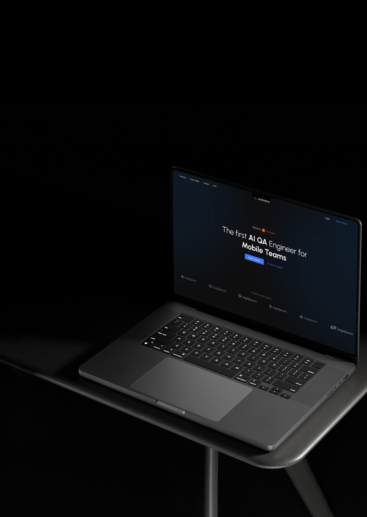
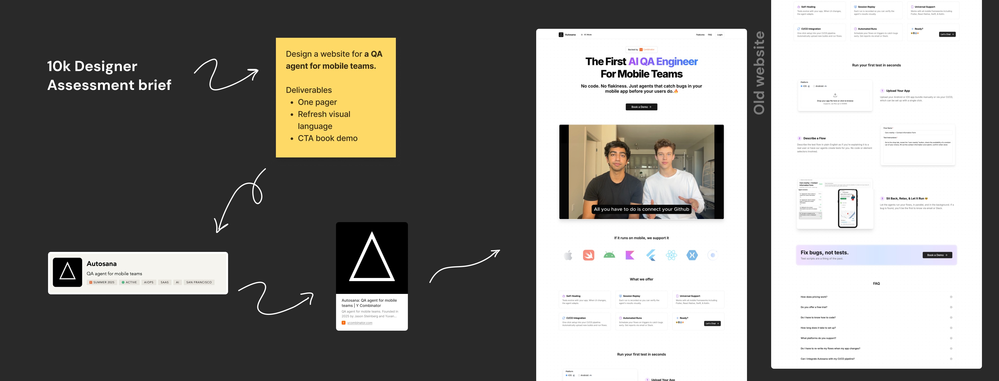
As part of the 10kdesigners cohort, I worked on a concept redesign of Autosana’s one-page website for its AI QA agent. The original website clearly explained the product but had scope for improvement in visual hierarchy, section clarity, and mobile responsiveness. The goal of this project was to reimagine the website with a cleaner UI and a more UX-driven structure that helps mobile teams quickly understand the product’s value and take action.
Role
Product designer
Tools used
" height="16.0001px" id="FvV2bZIOh" transform="translate(8 32)" width="16.0002px"/><path d="M 0 8 C 0 3.584 3.584 0 8 0 L 16 0 L 16 16 L 8 16 C 3.584 16 0 12.416 0 8 Z" fill="rgb(162, 89, 255)" height="15.99990000837013px" id="RVORvpNaV" transform="translate(8 16)" width="16.0002px"/><path d="M 0 8 C 0 3.584 3.584 0 8 0 L 16 0 L 16 16 L 8 16 C 3.584 16 0 12.416 0 8 Z" fill="rgb(242, 78, 30)" height="15.9999px" id="DyVBic4xS" transform="translate(8 0)" width="16.0002px"/><path d="M 0 0 L 8 0 C 12.416 0 16 3.584 16 8 C 16 12.416 12.416 16 8 16 L 0 16 Z" fill="rgb(255, 114, 98)" height="15.9999px" id="Cqreyr91H" transform="translate(24 0)" width="16.0002px"/><path d="M 16 8 C 16 12.416 12.416 16 8 16 C 3.584 16 0 12.416 0 8 C 0 3.584 3.584 0 8 0 C 12.416 0 16 3.584 16 8 Z" fill="rgb(26, 188, 254)" height="16.0001px" id="WDhYWlZH7" transform="translate(24 16)" width="16.0002px"/></g></svg>)
Figma
Problem
Identifying gaps in clarity, hierarchy, and responsiveness
Autosana’s existing website communicated the core idea of an AI-powered QA agent, but the experience could be improved for first-time visitors especially mobile teams. Key information was spread across dense sections, making it harder to quickly scan, understand the product’s value, and identify the next action. On smaller screens, the lack of clear hierarchy and section prioritisation further reduced readability and usability.
As a result, the website had scope to better guide users through the product story with clearer structure, improved visual hierarchy, and a more mobile-first approach.
Key challenges identified
Dense content made quick scanning difficult
Visual hierarchy did not clearly guide users through the page
Value proposition required more clarity for first-time users
Mobile experience needed better structure and responsiveness

Solution
Creating a clear, UX-driven one-page experience
I redesigned Autosana’s website as a concept one-page experience with a strong focus on clarity, structure, and responsiveness. The solution centered on improving information hierarchy, simplifying content flow, and presenting the product’s value in a way that is easy to scan and understand—especially for first-time users and mobile teams.
Key sections were reorganized to guide users through the product story more naturally, with clear entry points, supporting visuals, and well-defined calls to action. The design was approached with a mobile-first mindset, ensuring the experience remains consistent, readable, and usable across devices while maintaining a clean, modern SaaS visual style.
Highlights
Clear information hierarchy and section prioritization
UX-driven content structure for better scanability
Mobile-first, responsive layout
Clean and modern UI aligned with SaaS products

Outcome
A clearer and more approachable product experience
The final outcome was a UX-focused, responsive one-page website concept that presents Autosana’s QA agent in a clearer and more structured way. The redesigned layout improves scanability, highlights the product’s key value propositions, and guides users through the page more effectively.
By simplifying content and prioritizing mobile usability, the design offers a more approachable experience for first-time visitors while maintaining a modern, SaaS-focused visual language. This concept demonstrates how thoughtful UI and UX decisions can improve clarity and engagement without changing the underlying product.